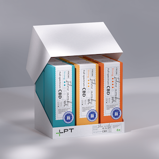
Creative Packaging Design for Health Products: Practical yet Full of Fashion Sense
A new CBD oil product has recently been launched, focusing on functions such as improving sleep, relieving anxiety and alleviating pain. The core task this time is to design the outer packaging for this product: it must convey a sense of trustworthiness rooted in safety and reliability, while avoiding consumer concerns arising from the fact that its ingredient is derived from cannabis. The design strategy abandons the cannabis-related elements commonly used in traditional CBD oil packaging – instead, it draws inspiration from the "sense of medical professionalism" and uses "doctor's prescription" as a visual metaphor to shape a clear and credible brand image.
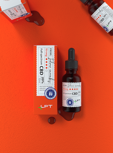
For the font scheme, the Northwell font simulates the handwritten style of prescription notes, conveying a feeling that balances approachability and professionalism; the Mukta Mahee font, on the other hand, features a concise and rigorous structure. It creates a balance with the former, enhancing the overall readability and modern feel of the packaging.
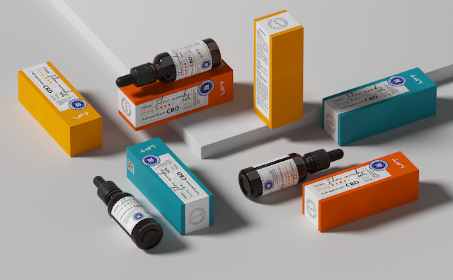
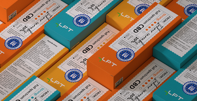
The color system is differentiated according to product strength, using soft green, yellow and red tones. This not only inherits the color logic of classic pharmacies, allowing users to intuitively understand the product strength levels, but also embodies the properties of relaxation and sleep aid through low saturation, striking a delicate balance between tradition and modernity.
Foldable paper box
Textured paper with printing
CMYK+1PMS printing
Shipped by flat