POTTSOA Chocolate Unveils Innovative Packaging Design in the Chinese Market
POTTSOA, a well - known chocolate brand, has launched an innovative packaging design in the Chinese market. This design cleverly combines Swiss chocolate - making traditions with modern concepts appealing to today's consumers.
Triangular Design: A Symbol of Creativity and Cohesion
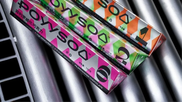
The triangle lies at the core of POTTSOA's new packaging. As a visually striking and symbolically rich shape, it's part of the brand logo. It represents creativity and cohesion, and also embodies the brand's Swiss - derived rigorous craftsmanship.

Cultural Integration and Style Innovation
POTTSOA integrates elements of Chinese culture into the packaging, connecting with local consumers. The brand breaks from traditional chocolate packaging with a bold, unique color palette, highlighting its modern and youthful image.
Social Responsibility in Design
The packaging includes Braille circles, demonstrating POTTSOA's commitment to inclusivity. This new packaging showcases POTTSOA's blend of quality, innovation, cultural understanding, and social responsibility.
