Beyond Art, Within the Packaging
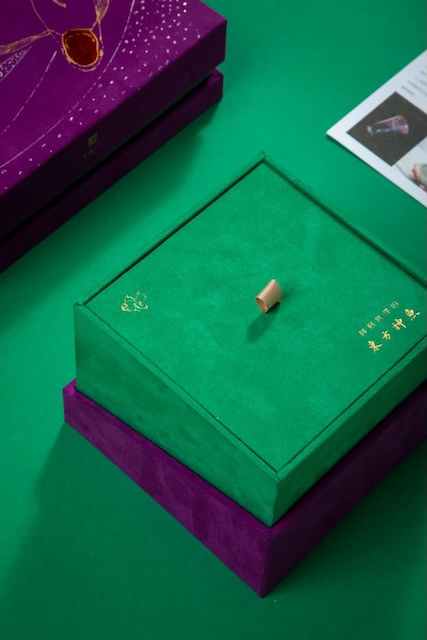
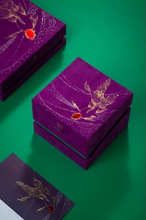
The packaging is dominated by two traditional Chinese colors – "Harrier Crown Purple" and "Palace Green", exuding elegance and nobility with a distinct oriental charm. Harrier Crown Purple does not deliver a striking visual impact, but serves as a metaphor that precipitates oriental aesthetics, akin to a mysterious and enchanting poem, carrying profound cultural heritage and unique connotations. The purple hue is rich in symbolism, representing not only nobility and mystery but also auspiciousness.
Palace Green, on the other hand, embodies another natural syntax. It is neither as ostentatious as the fresh lotus leaves in midsummer nor as tender as the willow buds in early spring, but rather a mellow and gentle after precipitation, symbolizing vitality and vigor, and representing boundless hope.
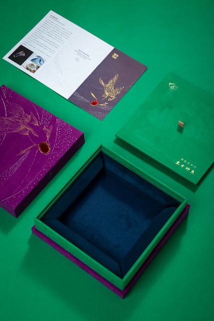
These two seemingly contradictory hues are deconstructed into another aesthetic language in the designer. The result is both solemn and nimble and vivid serving as a tribute to traditional aesthetics while also being a deconstruction of modern design language.