Vintage Packaging Design: An Aesthetic Feast Through Time and the Magic of Brands
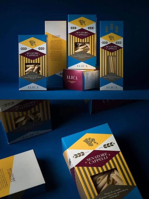
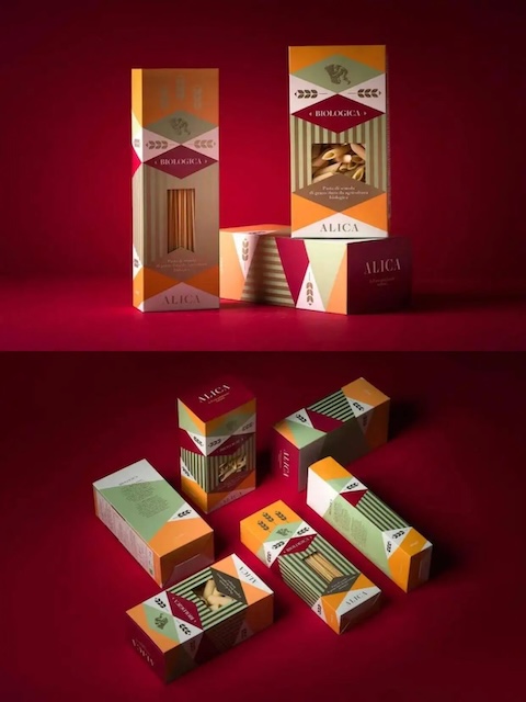
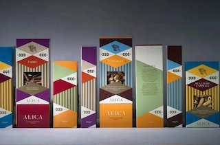
While most food packaging still relies on bright colors and enticing images to grab attention, Alica pasta has taken a completely opposite path—a perfect fusion of minimalism and retro aesthetics. This packaging abandons the common images of ingredients or cooked dishes found on traditional pasta packages; instead, it employs large areas of negative space and exquisite geometric lines, exuding a sophisticated texture reminiscent of museum artifacts.
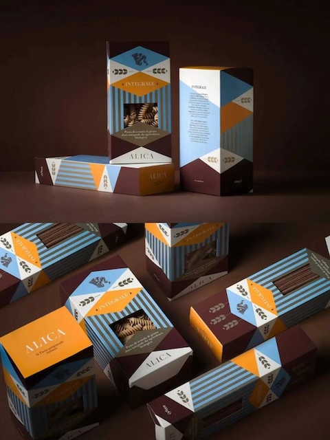
The design team drew inspiration from mid-20th century Italian modernist design, particularly the prevailing "less is more" design philosophy of that era. The minimalist lines on the packaging not only outline the basic form of the pasta but, through the use of negative space, also allow consumers' imagination to roam freely.
In terms of material selection, the designers opted for high-quality paper with subtle textures, paired with gold stamping or debossing techniques. This combination reveals an understated luxury within the minimalism.