What became of those packaging designs that use colors boldly afterward?!
The "bold use of colors" in product packaging can attract consumers by creating visual focus, but it needs to accurately align with the brand's core, target audience, usage scenarios, and cultural context. It is not about blindly piling up colors; only then can it be effective.
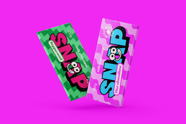
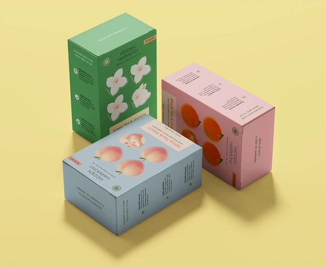
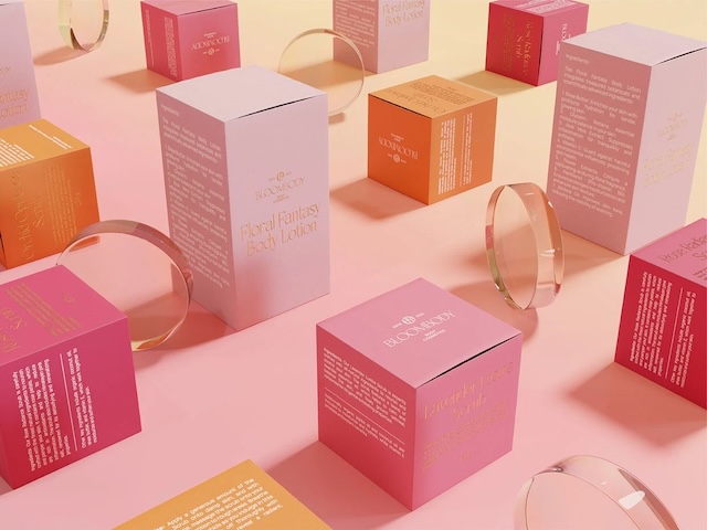
Simplified content: On supermarket shelves, the bold use of colors in product packaging may make a product a hit or lead to its failure. Successful cases include a sparkling water brand that used rainbow gradient + fluorescent orange to create visual explosion points, with its sales surging to the top three among similar products within three months, as its colors aligned with young users' need for "vitality"; a skincare brand, going against common sense, used deep purple with bright pink, echoing the life scenarios of night owls and becoming a topic-worthy product. Failed cases include a nut brand that piled up multiple colors, which contradicted its "high-end national trend" positioning and was thus taken off the shelves; baby wipes from a maternal and infant brand used dazzling colors that did not meet the need for "softness"; and an imported snack's color scheme failed to gain popularity due to differences in cultural context. It can be seen that bold use of colors is not a hodgepodge of colors but requires calculating three accounts: aligning with the color preferences of the target audience, adapting to the scenarios where the product appears, and becoming the brand's visual memory points.