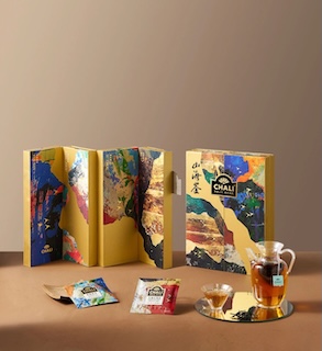
Every qualified package is a true pinnacle of creative genius
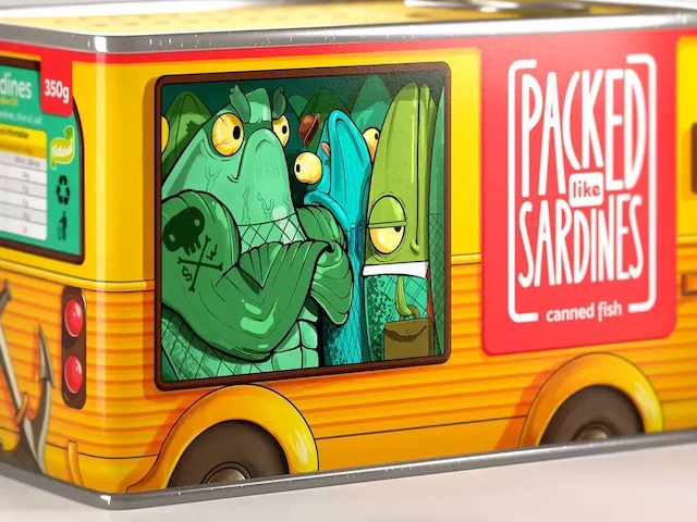
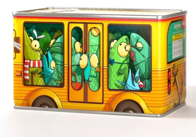
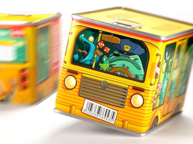
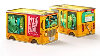
Drawing inspiration from the Russian idiom "packed like herring barrels" (equivalent to the English phrase "packed like sardines"), Brandiziac Design Studio has created a unique packaging concept for herring cans. This idiom, which vividly describes overcrowded scenarios often associated with public transportation, inspired the team to shape the can into the form of a bus. Visually, the packaging employs a realistic painting style to meticulously depict a bustling bus interior on the can's surface, where people are crammed together like sardines—a playful analogy to the tightly packed herring inside.
This distinctive design not only infuses the packaging with storytelling and whimsy but also leverages a universally recognized cultural symbol to resonate with consumers across different backgrounds. For those familiar with the idiom, the design instantly sparks recognition and amusement; for others, its striking visuals invite curiosity and exploration. By integrating cultural symbolism into the creative packaging, the herring cans have successfully established a unique brand identity, appealing to consumers seeking novelty and cultural depth. This approach also adds cultural value to the product, enhancing its market competitiveness.