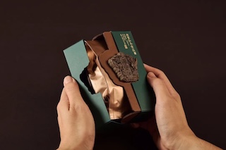
Redefining Tea-Drinking Experiences with Minimalist Aesthetics: These Flavored Tea Packages Are a Sight to Behold!
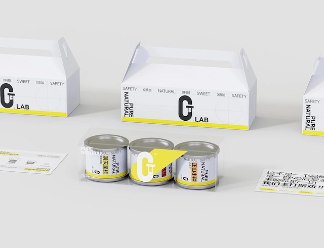
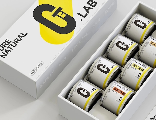
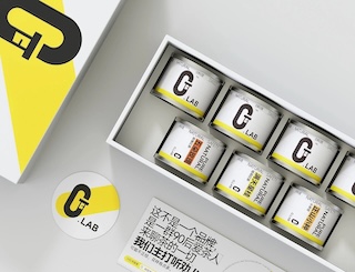
This is the first packaging design of the Jicheng brand - the G.LAB series. The overall design draws inspiration from the precision and purity of a laboratory, seamlessly blending tea innovation with a scientific approach. Centered around the visual core of the LOGO symbol, the clean white base is accentuated by striking yellow test tube motifs, creating a professional lab atmosphere that metaphorically reflects Jicheng's meticulous quality control over tea leaves.
The bold yellow test tube icon not only reinforces the "Lab" concept but also serves as a strong visual memory point. Departing from traditional tea packaging's elaborate decorations, the can label adopts a modular geometric layout. Through a precise grid system, it conveys the product's scientific rigor, meeting young consumers' demand for transparent information.
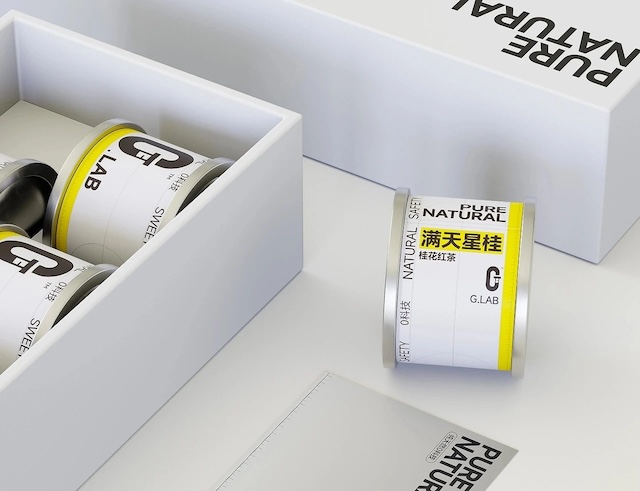
For different tea flavors, designers cleverly use color-coded background labels for differentiation. Each color's saturation maintains visual consistency while enabling consumers to quickly identify target products on store shelves.