The gift box packaging with a color strategy is definitely an "attention-grabber"!
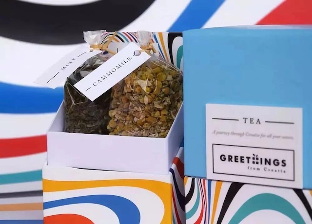
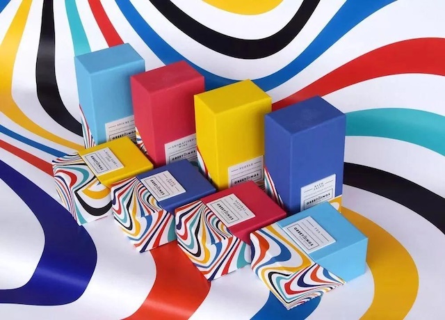
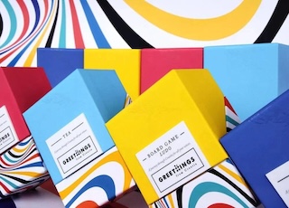
In an era where packaging design is increasingly homogenized, a specialty brand from Croatia has redefined visual aesthetics with a storm of colors. More than 20 kinds of specialties carrying the breath of the Adriatic Sea — from amber-colored liqueurs to honey soaked in Dalmatian sunshine — each are assigned a unique color code. The bright and colorful main tones are like the Croatian summer coastline, the pure color blocks at the top resemble a clear sky, and the dancing black logos and white prints at the bottom are like the waves of the Adriatic Sea crashing against the rocks. The most wonderful part is the layered and intertwined colorful swirls, just like the passionate and unrestrained folk dances of the Balkan Peninsula, making everyone who opens the gift box feel like unwrapping an artistic invitation from the Mediterranean.
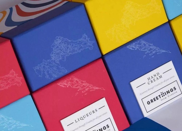
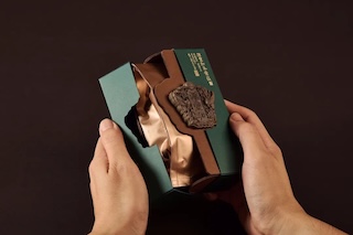
This ingenious design is not just a visual pleasure but also hides a clever practical logic. The thick box material combined with a magnetic closure design is not only a careful protection for the products but also an ultimate pursuit of a sense of ritual. When your fingertips touch the cool surface of the box and hear the "click" of the magnetic clasp closing, you can almost feel the Croatian craftsmen's dedication to quality. The color-coding system makes selection full of fun — lemon yellow represents fresh seasoning spices, deep blue corresponds to mellow aged liqueurs, and consumers can easily find their favorite flavors at a glance.