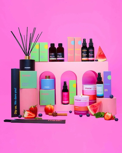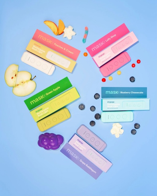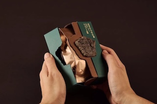
Color is power—let packaging capture hearts at first glance
In today's highly competitive market environment, product packaging is no longer just a shell to protect goods, but also the first bridge for communication between brands and consumers. Among these bridges, color is undoubtedly the most direct and powerful language.
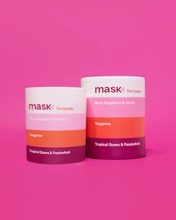
Color is one of the elements in visual information that is perceived fastest. It can evoke emotions, guide attention, and even subtly shape a brand's personality. When a set of packaging is neatly displayed on the shelf, what first catches consumers' eyes is often not the pattern or text, but the color. A creative and visually striking color combination can often achieve visual attraction and emotional connection in a very short time, forming a memorable first impression.
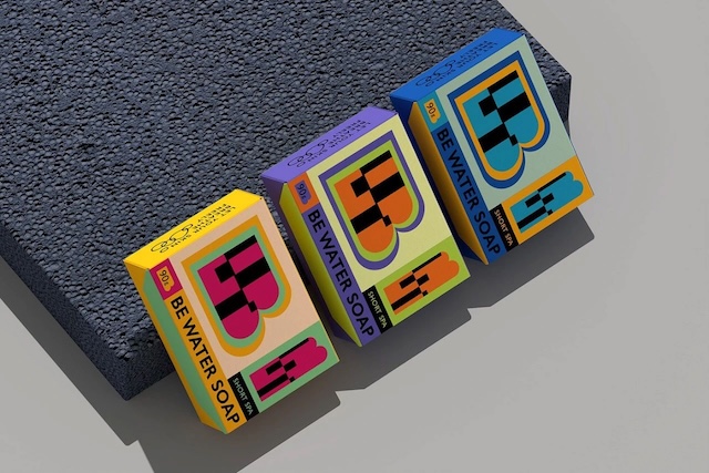
In the packaging design of product lines, the application of color matching is not only related to aesthetics but also bears multiple functions such as brand recognition, differentiation of product attributes, and consumer perception. Reasonable color planning can help series products maintain individuality within unity and establish order amid changes. When designers skillfully integrate color psychology and visual balance, they can create series packaging that combines systematicness and visual tension, enabling products to stand out in fierce display competition and strengthen brand memory.