Upgraded Herbal Tea Packaging Solutions for International Markets | Packaging Everything
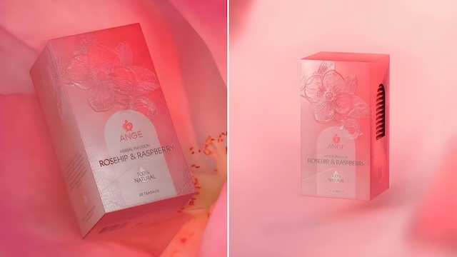
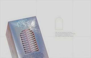
The Ange brand emphasizes harmonious coexistence with nature. The logo takes the outline of an angel as its image, with a drop of water embedded in the wings, symbolizing the energy of nature.
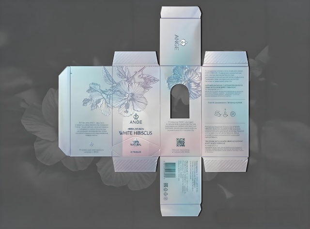
Designed using the golden ratio, the reasonable proportion of elements makes the graphic achieve extreme coordination and balance. In packaging, modern and simple sans-serif fonts enhance the brand's aesthetic appeal. Central axis symmetry reflects the concept of harmony and balance. The arched hollow window is a metaphor, representing a window to the world of Ange natural drinks and displaying the products. The scheme uses the process of laser cardboard plus UV printing, paired with embossing embellishments, creating expressive visual effects and excellent tactile sensations.